It feels to me like…a lot of the presentation code I do is to aggregate things into some kind of pivot table.
But I wasn’t thinking that clearly — I had just rebuilt our database of nessus scan data from the 8GB of XML I have harvested over the last 15 months of weekly scans of our network. Then I found https://pivottable.js.org/examples/ and I wanted to try it, but needed a useful data source…and I’d just built…a data source.
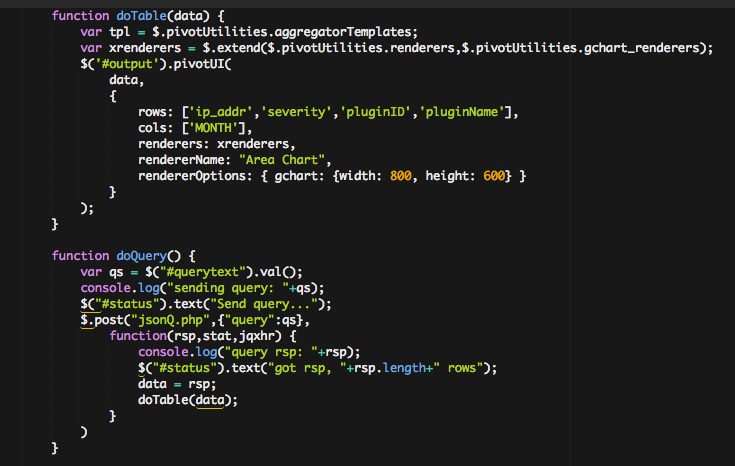
So I built a little AJAX query for my nessus scan data, and then included the pivottable.js library and the google charts API…a little bit of code to do the AJAX query, and a simple wrapper to render the pivottableUI
This produces a UI that lets you pivot the data by different rows / columns, choose different aggregators and present this in various chart and tabular / heatmap formats.
Which all…sounds, uh…great.
What does that mean? Well…I realised this was a classic case of:
- I didn’t know what I wanted
- But I knew I didn’t have it
- And I’d know it when I saw it…
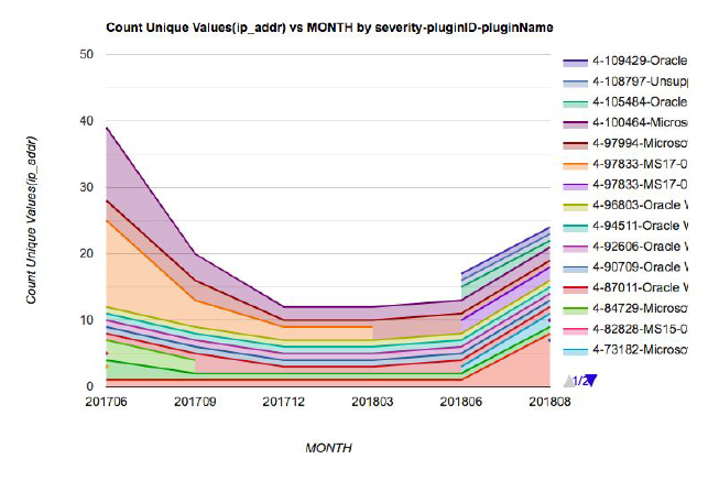
I started playing with this, and suddenly realised I could zoom in from the high-level aggregate view of our network vulnerability posture right down to which hosts were problematic and in which ways.
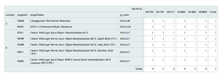
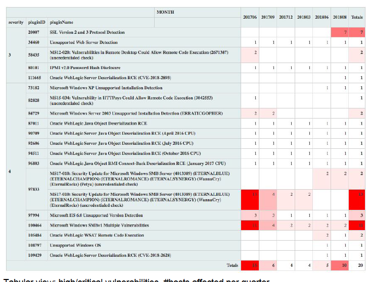
I can get a graph that lets me track the number of hosts in a given subnet with high / critical severity vulnerabilities per month. I can then split this up by vulnerability.
I can use a table view to see which vulnerabilities are increasing, which are not getting resolved.
I can zero in on problem hosts. I can look at which ports / services are the problem areas.